Color grading is where you admit what you really felt on set.
On set, you lie. You smile. You reassure. You pretend the schedule isn't a guillotine and the client notes aren't a polite form of violence. You say "we've got it" even when you're improvising with prayer and caffeine. In the grade, the truth leaks out. The scene was colder than you admitted. The room was lonelier. The performance was more fragile. The day had a bruise on it.
Film stocks used to impose psychology by default. They arrived with bias baked in—romantic, brutal, indifferent, nostalgic. Digital is a blank therapist's couch. AI is the therapist who agrees with everything you say, which is not therapy; it's indulgence. Indulgence produces pretty images that can't tell the truth.
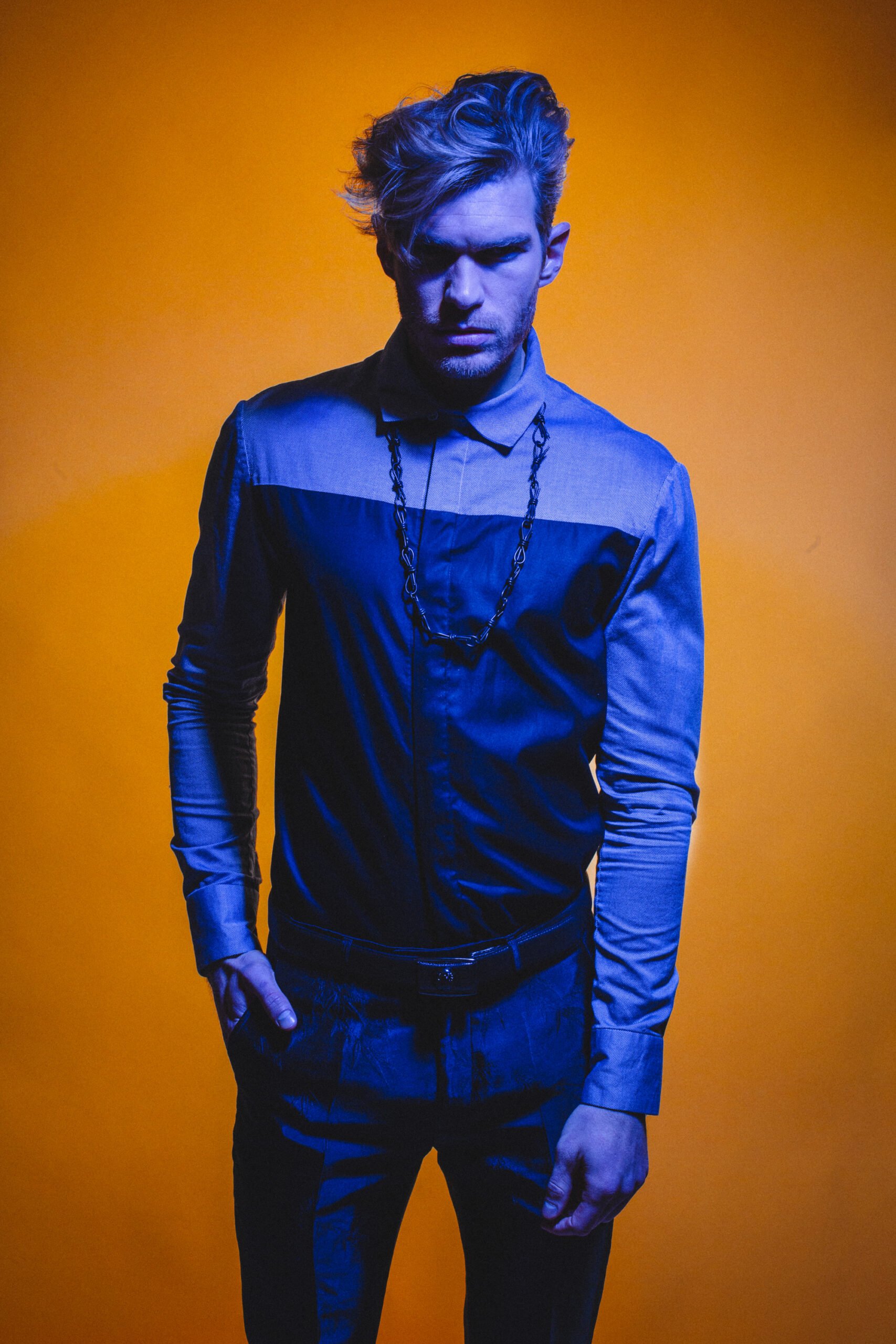
The grade is a declaration. It's not "making it look good." It's answering: what did this moment feel like, and what does it mean? Do the highlights feel like memory or like fluorescence? Do the shadows feel like safety or like threat? Is the skin tone a confession or a mask? Are the colors seductive, sickly, or sterile?
And yes, modern workflows are powerful. You can match shots with uncanny precision. You can isolate tones and sculpt them like clay. You can create continuity so smooth it feels like fate. That's all useful. The danger is that the software starts grading for you while you call it "efficiency." Efficiency without authorship is a factory.
The best grades clarify rather than beautify. They articulate what you were too polite to say out loud. If your work is broody, let it be broody with intelligence. If it's hopeful, don't fake warmth—earn it with contrast, with restraint, with a willingness to let the shadows remain honest.
Color is emotion with a technical interface. Treat it like therapy: uncomfortable, precise, and ultimately freeing.